
How Selecting Art Can Transform the Atmosphere of a Living Space
Written by Lea Collins.
Art does more than decorate. The right piece can shift a room’s temperature, change how voices sound in it, and influence how long people want to stay. Think of it as atmosphere control you can see.
Color Tones Set The Mood
Color is the quickest lever for changing how a space feels. Soft palettes make rooms seem larger and quieter, and saturated hues dial up energy and focus. Read your existing finishes, then choose art canvas prints that either harmonizes or deliberately contrasts using Canva to preview colors and layouts can help you see what works before committing.
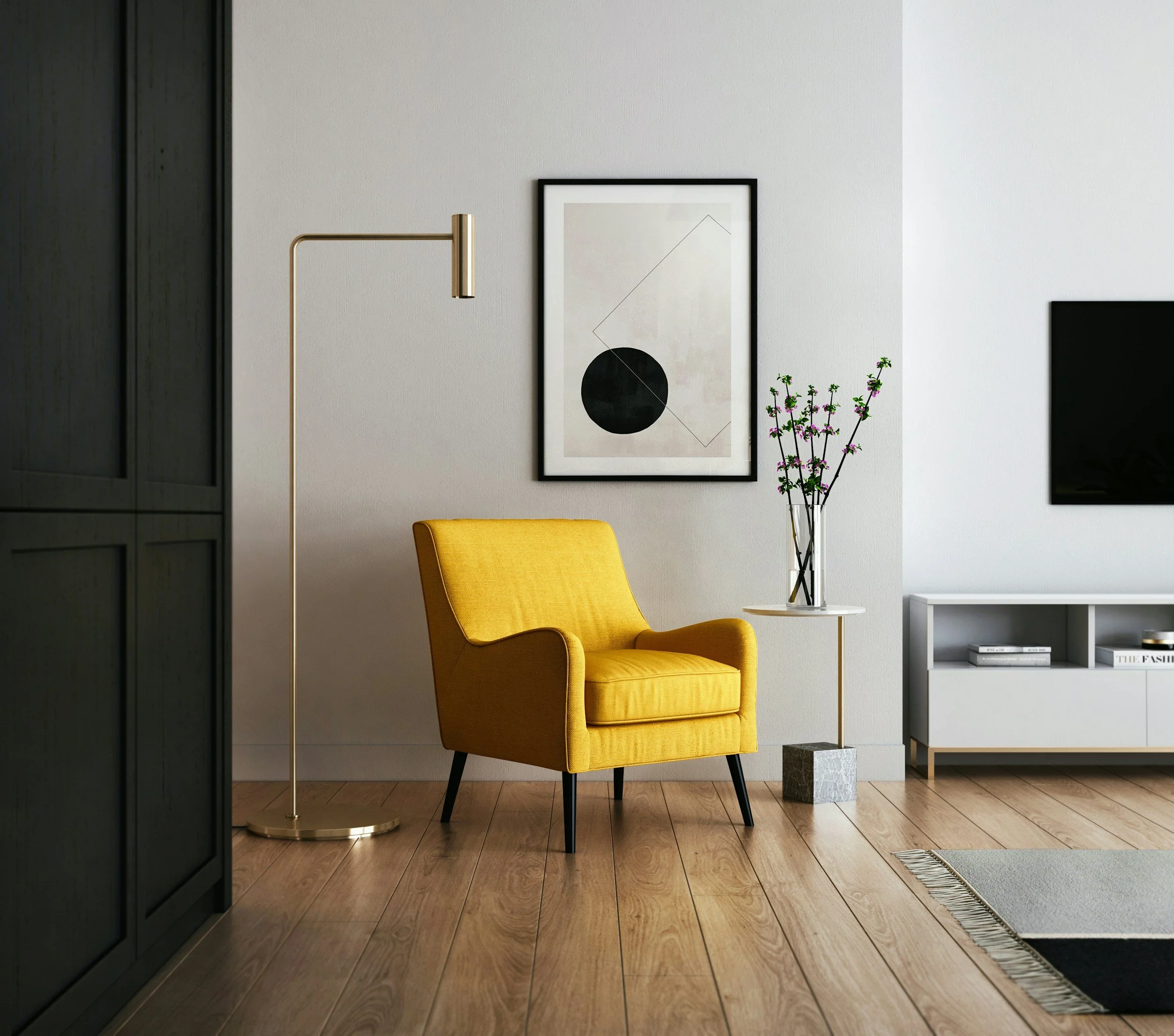
A home style magazine recently spotlighted butter yellow as a standout color for 2025, noting its mellow brightness. That matters because artwork with warm notes can balance cool floors or stark walls, and it can make evening light feel friendlier. Even a small canvas with a gentle yellow undertone can warm an entire seating area.
Nature’s Calm Inside the Home
Rooms feel safer and slower when they include cues from the natural world. Landscapes, botanicals, and water scenes tell our brains this is a place to breathe. You can layer these cues with plants, natural fiber rugs, and art that mirrors outdoor textures.
Consider a composition that echoes the coast: the horizon line helps settle the eye, and tidal gradients are naturally rhythmic. Choose beach and ocean wall art that can be placed above sofas or consoles to invite exhale. Keep nearby decor quiet so the image can do the calming work.
Scale, Placement, and Breathing Room
Scale determines whether art feels like a statement or a whisper. Oversized work above a sofa can visually anchor the whole wall, while a tight gallery grid brings a tailored vibe. Try to cover two-thirds to three-quarters of the furniture width so the art reads as intentional.
Placement is as important as size. Hang large pieces slightly lower than you think, so they connect with the furniture grouping. Give each piece breathing room, at least a hand’s width from lamps, drapery, or door casings, so edges don’t feel cramped.
Textures, Frames, and Materials
Canvas with visible weave, matte paper, and deckled edges all add tactile interest that softens modern rooms. Even photography printed on textured rag paper can read warmer and more layered than a high-gloss finish.
Frames act like punctuation. Thin metal frames feel crisp, and wood frames add organic warmth. When mixing frames, keep either color or profile consistent so the collection looks curated. Mats can introduce a quiet border that lets colors relax before they meet the wall.
Choose one dominant frame tone for cohesion
Use mats to lighten dense compositions
Mix gloss and matte sparingly for balance
Repeat a texture at least twice in the room
Let at least one piece be unframed for relief
Light and Reflection
Light can elevate or flatten art. Natural light shifts color temperature across the day, so view pieces morning and evening before committing. In darker rooms, picture lights or a nearby floor lamp can restore lost contrast and detail.
Glass choice changes reflections and glare. Non-glare glazing softens reflections in bright rooms but can mute deep blacks. Standard glass keeps contrast high for monochrome photography, but you may need to angle lamps thoughtfully to avoid hotspots.
Art for Well-Being
There is a health case for art that nods to nature. A professional association in psychology summarized research showing that exposure to natural elements supports mental health by lowering stress and improving mood. This aligns with how many people describe feeling calmer near imagery of forests, skies, and water.
Even very brief encounters help. Just 30 seconds of imagining a restorative natural place increased relaxation and positive emotion. Placing a small seascape at a desk or an entry console can create that tiny reset as you pass by, which adds up across the day.
Curating a Living Story
Great collections grow slowly. Start with one anchor piece that sets the emotional baseline for the room, then add companions that echo a color, a line direction, or a subject. This keeps the variety feeling like a family, not a crowd.
Rotate work with the seasons to refresh the mood without repainting. Cooler scenes in summer can feel airy, while pieces with warmth and depth bring comfort in winter. Keep a simple storage system (acid-free sleeves and a flat box) so swapping art is easy and safe.
Selecting art is an ongoing dialogue between how you want to feel and how a room behaves. When color, subject, scale, and light line up, the atmosphere clicks into place, and the space starts working with you instead of against you. That’s when a living room becomes lived in.
Related: